
Have you ever walked into a room and felt like something was just right? Or maybe you decorated your own room but it doesn’t feel quite balanced? The answer might be the 70/30 rule. This is a simple trick that designers use to make rooms look perfect.
At Liger Interiors, we want to help you make your home beautiful without making it hard. Today, we will explain the 70/30 rule in very easy words so you can use it right away in your home.
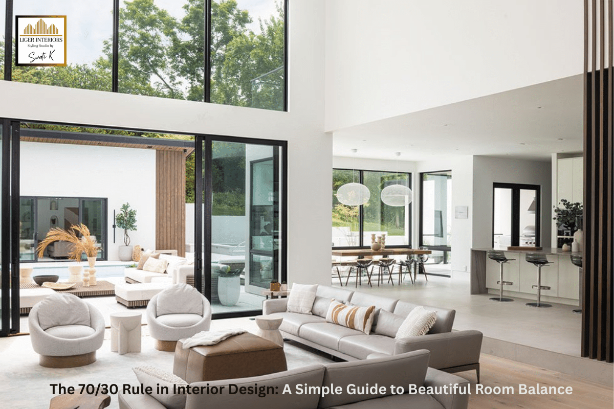
What is the 70/30 Rule and How Does It Work in Your Home
The 70/30 rule is very simple. It means that 70% of your room should be one primary color or style. The other 30% should be a different accent color or style. This creates a nice balance that makes your room look good.
Think about it like this: if your whole room is one color, it looks flat and boring. If your room has too many colors, it looks messy and busy. But when you use 70% of one main color and 30% of another color, it looks just right.
This rule is a bit different from the 80/20 rule. The 70/30 rule gives you more accent color, which means your room can have more personality and life while still looking balanced.
Why the 70/30 Rule Makes Rooms Look More Interesting
Our eyes like to see balance, but they also like to see some variety. The 70/30 rule gives us both.
The 70% part creates a main feeling in your room. It sets the mood and tells people what your style is. The 30% part adds excitement and makes your room special. It shows your personality and makes people look around the room.
With 30% accent instead of just 20%, you have more freedom to be creative. You can add more color, more patterns, or more of a second style. This makes the 70/30 rule perfect for people who want their rooms to be a bit bolder and more fun.
Simple Ways to Use the 70/30 Rule with Colors in Every Room
Colors are the easiest way to start with this rule. Here is how to do it:
Choose Your Primary Color: Pick one color for 70% of your room. This is usually a neutral color like white, cream, gray, or beige. Use this color on your walls and big furniture.
Choose Your Accent Color: Pick a second color for 30% of your room. This can be a bright color or a darker shade. Use this on smaller furniture, pillows, curtains, and decorations.
Here is a helpful table showing good color combinations:
| Primary Color (70%) | Accent Color (30%) | Best For | Room Feeling |
| White | Navy Blue | Living room, bedroom | Clean and elegant |
| Beige | Emerald Green | Living room, office | Warm and fresh |
| Light Gray | Mustard Yellow | Bedroom, kitchen | Modern and cheerful |
| Cream | Terracotta Orange | Dining room, living room | Cozy and inviting |
| Soft Blue | Coral Pink | Bedroom, bathroom | Calm and pretty |
| Warm Gray | Deep Purple | Bedroom, living room | Sophisticated and rich |
How to Apply the 70/30 Rule in Your Living Room for Best Results
Your living room is a great place to start using this rule. Here is a step by step guide:
Step 1: Paint your walls in your primary color. Most people choose a light neutral color like beige, light gray, or soft white.
Step 2: Choose a large sofa in the same primary color family. It doesn’t have to match exactly, but it should be close.
Step 3: Pick your accent color. This should be something you love and that makes you happy.
Step 4: Add accent items. Put accent color pillows on your sofa. Add an accent color rug. Hang accent color curtains. Add accent color in picture frames and decorations.
Step 5: Look at your room. Count roughly how much of each color you see. If you see too much accent color, remove some items. If it looks boring, add more accent items.
Here is a breakdown of items in a living room:
| Item | Use Primary Color (70%) | Use Accent Color (30%) |
| Walls | Yes | No |
| Large Sofa | Yes | No |
| Armchair | Can be either | Good place for accent |
| Coffee Table | Yes | No |
| Rug | Can be either | Good place for accent |
| Curtains | Can be either | Good place for accent |
| Throw Pillows | Some in primary | Most in accent |
| Wall Art | Some neutral | Some with accent color |
| Decorative Items | Some in primary | Most in accent |
| Throw Blanket | Can be either | Good place for accent |
Using the 70/30 Rule in Your Bedroom to Create a Relaxing Space
Your bedroom should help you relax and sleep well. The 70/30 rule works perfectly here.
The 70% Part: Use calm, soft colors for your walls, bed frame, and large furniture. Choose colors like soft white, pale blue, light gray, or warm beige. These help you feel calm.
The 30% Part: Add your favorite accent color with bedding, pillows, curtains, and small decorations. You can use a bit brighter color here because 30% is enough to add interest without being too much.
For example, if you have white walls and a gray bed, add teal blue pillows, a teal throw blanket, and teal curtains. This gives you personality while keeping the room peaceful.
The (3 5 7) Rule in Interior Design: A Simple Guide to Beautiful Spaces
How to Use This Rule in Your Kitchen and Dining Room
Kitchens and dining rooms are happy places where families gather. The 70/30 rule makes these spaces feel welcoming.
For the Kitchen: If you have white cabinets and white walls, that is your 70%. Add accent color with your dining chairs, dish towels, small appliances, and decorative items.
For the Dining Room: If you have a wood dining table and neutral walls, add accent color with your chair cushions, table runner, wall art, and a centerpiece.
Here is a simple guide:
| Area | Primary Elements (70%) | Accent Elements (30%) |
| Kitchen | Cabinets, walls, large appliances, counters | Chairs, towels, bowls, utensil holder, rug |
| Dining Room | Table, walls, large cabinet | Chair cushions, table runner, centerpiece, art |
Common Mistakes to Avoid When Using the 70/30 Rule
Here are mistakes people make and how to avoid them:
Using Too Many Different Colors: Stick to one primary color and one or two accent colors. Don’t use five different colors.
Not Counting All the Elements: Remember to count your curtains, rug, and decorations when thinking about percentages. People often forget these.
Making Accents Too Small: With 30% accent, don’t be shy. Use enough accent color so people can see it and enjoy it.
Forgetting About Whites and Neutrals: White, cream, and beige count as colors too. Include them in your 70%.
Here is what to do and what not to do:
| Do This | Don’t Do This |
| Use one main primary color | Use three different primary colors |
| Use one or two accent colors | Use five accent colors |
| Spread accent color around the room | Put all accent color in one corner |
| Use different shades of your accent color | Use the exact same shade everywhere |
| Include furniture in your count | Only think about small decorations |
| Be bold with your 30% | Make your accents too tiny to see |
Easy Ways to Start Using the 70/30 Rule in Your Home Today
Look at What You Have: Walk around your room. What color do you see the most? That can be your 70%. What color would look good with it? That can be your 30%.
Start with Pillows: The easiest way to add accent color is with throw pillows. Buy new pillows in your chosen accent color.
Use Paint: Paint is not expensive. You can paint one wall in your accent color. This is called an accent wall.
Move Things Around: Look in other rooms. You might have items in your accent color that you can move to this room.
Buy Small Items First: Before painting or buying big furniture, try your color idea with small items like candles, vases, or picture frames.
How to Change Your Look with Different Seasons Using the 70/30 Rule
The nice thing about the 70/30 rule is you can change the accent color easily. Your 70% primary color stays the same, but you can switch the 30% accent items.
Here are ideas for each season:
| Season | Keep Same (70%) | Change This (30%) | Accent Color Ideas |
| Spring | Neutral walls and furniture | Pillows, throws, decorations | Soft pink, light green, lavender |
| Summer | Neutral walls and furniture | Pillows, throws, decorations | Bright blue, coral, sunny yellow |
| Fall | Neutral walls and furniture | Pillows, throws, decorations | Burnt orange, deep red, brown |
| Winter | Neutral walls and furniture | Pillows, throws, decorations | Deep blue, silver, burgundy |
This way your home feels new and fresh without spending too much money or time.
Understanding the Difference Between 70/30 and 80/20 Rules
You might wonder how the 70/30 rule is different from the 80/20 rule. Here is a simple comparison:
| Aspect | 70/30 Rule | 80/20 Rule |
| Accent Amount | 30% accent color | 20% accent color |
| Room Feel | More colorful and bold | More calm and minimal |
| Best For | People who love color | People who like simple looks |
| Flexibility | More accent options | Less accent, more subtle |
| Visual Impact | Stronger, more noticeable | Softer, more gentle |
Both rules work well. Choose based on how much color and personality you want in your room.
Final Thoughts on Making Your Home Beautiful with the 70/30 Rule
The 70/30 rule is a wonderful design trick that makes decorating easy. By using 70% of one primary color and 30% of an accent color, you create rooms that are balanced, interesting, and beautiful.
This rule gives you more freedom than the 80/20 rule because you can use more accent color. This is perfect if you love color and want your personality to shine in your home.
Remember, these percentages don’t have to be exact. They are a guide to help you. Trust your eyes. If your room looks good to you, then you did it right.
Ready to try the 70/30 rule? Pick one room today. Choose your primary color for 70% and your favorite accent color for 30%. You will love how much better your room looks. Happy decorating from everyone at Liger Interiors!